As the COVID-19 pandemic grips the world, Canadians have been presented with a profusion of statistics, graphs and other data visualizations about the number of cases, deaths and spread of the disease.

But making sense of all this data can be a challenge, particularly if you’re not mathmatically inclined.
“There are a lot of numbers out there and it can be hard to follow and track them,” says Jeffrey Rosenthal (left), a professor in the department of statistical sciences in the University of Toronto’s Faculty of Arts & Science.
“Every different way of visualizing data is going to give a somewhat different impression. So you have to understand what they mean.”
Arts & Science writer Chris Sasaki recently asked Rosenthal what advice he’d give to Canadians trying to make sense of the numbers behind the pandemic. All figures and trends current as of March 31.
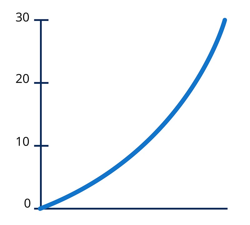
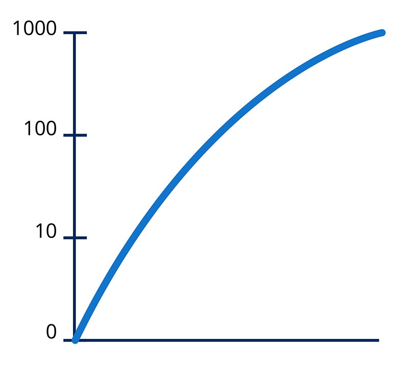
Most of the graphs we see showing the total number of cases or deaths are linear graphs, but there are also logarithmic graphs. What’s the difference between the two and what do they tell us about the pandemic?
Linear graphs look scary because they show the disease is growing exponentially. It’s like compound interest on an investment. Your investment grows more and more because you’re earning interest on the interest. Or, if something doubles each week, then after two weeks it is four times as large and after three weeks it is eight times as large and so on.So, linear graphs are accurate because that’s what happens in an epidemic.
But the same numbers plotted on a logarithmic graph can be informative because they can show how the rate of growth is changing and and whether or not it is exponential. And that’s the best way to measure whether our efforts – for example, through social distancing – are helping to slow the spread.
What should we look for as a sign the pandemic is slowing?
On a logarithmic graph, exponential growth looks like a straight, rising line. If our efforts to slow the spread are working, you’ll see the curve rising at a more and more shallow angle.
And there is some evidence that this is happening – that social distancing and other measures in Canada are having an effect. The logarithmic graph with Canadian data may be angling down a bit and that’s a good sign – [although] not a great sign because the number of cases are still going up and will continue to go up. But it would be a sign that measures are having a positive effect.
We’ve also seen maps superimposed with circles of different sizes representing numbers of cases or deaths for different locations. Are there any problems with this type of visualization?
Maps with circles representing numbers are generally good. But you have to be careful because they’re not consistent. In some, the number of cases is indicated by the diameter of the circle and in others it’s the area. That means that, for a given increase, the former circle will grow in size much faster because area is calculated by multiplying the number by itself.
What else should Canadians be mindful of as we track the numbers?
When you look at total numbers, you should look at the numbers as a percentage of the population or per capita. For example, if we compare Canada to the U.S., we might expect the U.S. to have about 10 times the number of cases because they have about 10 times the population. In fact, they have more than 20 times as many cases as us right now. So, it’s not simply that they have more cases because they have more people – they have twice the cases per capita.


