Comparing New Zealand’s regional economies is now made easier with a simple interactive tool, Stats NZ said today.
“We wanted to provide a way for people to easily see what industries make up their region’s economy and how this compares with other regions,” national accounts senior manager Ruvani Ratnayake said.
“Industry structures can vary greatly across regions and being able to represent this visually helps highlight the dominance of certain industries in particular regions and the level of diversification.”
The new online tool ‘Which industries contributed to your region’s GDP?’ lets users display a graphical side-by-side comparison of the industries making up the GDPs of two selected regions and see how these have changed over time. Comparisons with the national economy are also possible. An additional chart provides a time series comparison – a line graph for the selected regions with GDP per capita or percentage changes in GDP, and population.
Access Which industries contributed to your region’s GDP?
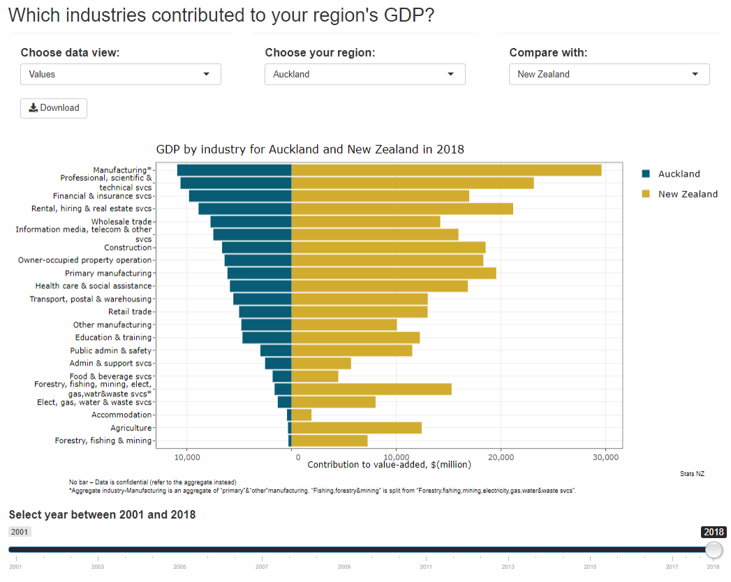
Image of tool’s bar chart showing GDP by industry for Auckland and NZ in 2018. Click image to access tool.
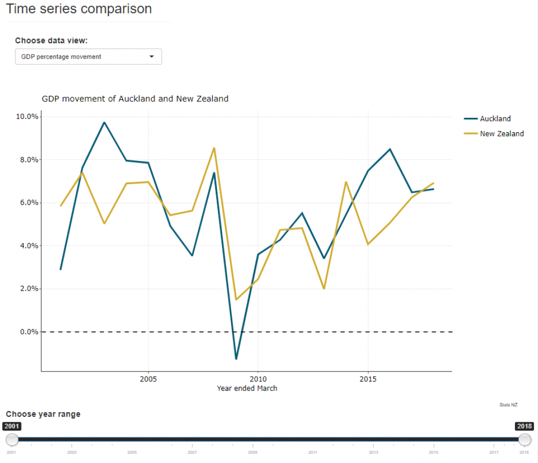
Image of tool’s line chart showing GDP movement of Auckland and NZ 2018. Click image to access tool.


